top of page
From Cover to Cover
The following is a selection from and process outline regarding the first children's picture book I illustrated and designed. The illustrations, including the cover, title logotype, and book layout design of this publication are my work.
The book will be available fall 2024.
Not an affiliate link.
The Details
Look inside the book
Book title: Hanksgiving: A Thanksgiving Tale
Book category: children's picture books
Illustrations by: Chris Wagner
Cover illustration by: Chris Wagner
Layout design by: Chris Wagner
Title logotype by: Chris Wagner
Writing by: Keith Ledet
Book size: 8.5" by 11" with .5" page margin and
.125 page bleed (not including binding edge)
Font: Embury Text Book
Font details: 12 pt, 20 pt leading, 75 tracking
Illustration medium: gouache paint
TheLayout Design
The print product of this project was a standard PDF/X-1a:2001 format PDF print file. All design work was accomplished in Adobe InDesign 2024.
A both text and illustration-
heavy document, Hanksgiving required careful balancing between the visual and textual information hierarchy.
The text block formatting came in several standard types. With large, dominate illustrations such as this one, blocks at the top margin or bottom emphasized the illustration. In other circumstances, smaller spot-illustrations were flanked top and bottom with their corresponding stanzas. In other cases, where appropriate, vertical or horizontal offsetting was used.

Page 5
The Logotype

The book title logotype, like many of the book's illustrations, was meant to evoke the comfort and coziness of the autumn season. Printer's flowers of leaves punctuate the hand-drawn aesthetic of the letters. Though a serif-style was chosen for the characters, relaxing curved lines contribute to the logotype's accessibility and friendliness. The spiral flourish of the tail of the "S" mirrors the illustrative use of air streamers throughout the book, connecting the graphic logotype to the rest of the book's visuals.
The Illustrations
Rich detail and plentiful autumn colors were the name of the game for the illustrations of Hanksgiving. Though other mediums, such as digital, colored pencil, and pastels were considered, the character, texture, and depth of my work with gouache were what led the author to choose this medium. Among my previous works I showed the author, my piece "Cello" was the one that convinced him gouache was the way to go.

"Cello" 2017
Character design was an important part of the pre-production phase of the illustration project. Each character had a design process consisting of a discussion of what the text of the book told us, what the author had in mind, input
from me, the illustrator on those subjects, and only after all of
that, sketches and eventually
finalized designs.
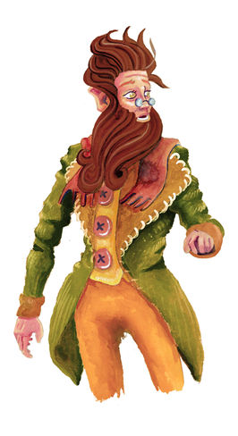
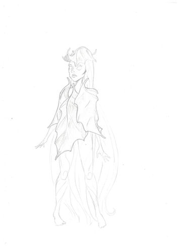
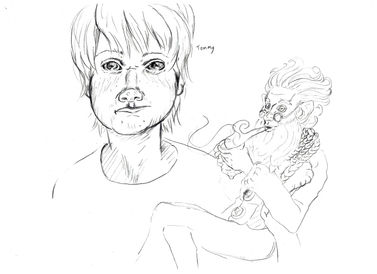
The titular character Hank, as well as his friend, the Wind, had the most in-depth design process. Below is a selection of the sketches and different ideas that went into making them what they eventually ended up being.
Hanksgiving Concept Sketches and Paintings
The Concept Design Process
From Cover to Cover
Hanksgiving is both my first illustration credit and the first published book that I designed. The title logotype, the layout, and the illustrations, everything you see in this book, from cover to cover, is an example of my design and illustration skills...and that vitally important place where they intersect. If you need someone who understands both sides of the process, an illustrator or designer, or both, please leave me a message below or email me at c.a.wagner.illustrator@gmail.com.
Hanksgiving will be available fall 2024.
The following is not an affiliate link; I do not receive any percentage of sales via the corresponding sales page.
bottom of page


